
How to use interactive map
CleverMaps visualisation of Covid-19 data and economic effects is available at covid-19.clevermaps.io. You get the best of the visualisation when you explore it on computer, interaction on tablet is limited. CleverMaps visualisation is not suitable for smartphones.
Data sources
- John Hopkins University
- Worldometers
How to give credit to CleverMaps in your article or post
You can embed the map via iframe or you can publish the link. Posting screenshots is also recommended. Please note that when using iframe, the window has to be big enough to accommodate the complex map.HOW TO READ CleverMaps
- Map and dashboard are both interactive, data are updated every 24hrs.
- They display a range of epidemiological data, and of economic effects using adjustable assumptions.
- Darker colours always indicate greater prevalence of currently selected phenomenon.
- You can select indicators, countries, timeframe, economic model assumptions, etc.:
HOW TO USE CleverMaps
To change displayed data, use the dashboard:- When you hover over an indicator, an Eye icon appears. Click it to display that indicator on the map.
- If instead you click the whole indicator button in the dashboard, further data are displayed.
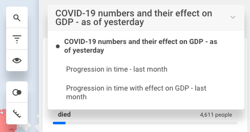
- Clicking the link takes you to the default view "COVID-19 numbers and their effect on GDP - as of yesterday". All data here are cumulative, since the beginning of the outbreak.
- If you select a different view at the top of the dashboard, you can subsequently change the period by clicking on it at the top of the map.
- Hovering over a country displays the country’s data for the currently selected indicator.
- Clicking the country displays the data on dashboard. Unclick the country to undo.
- Clicking with Shift selects more countries.
Further options
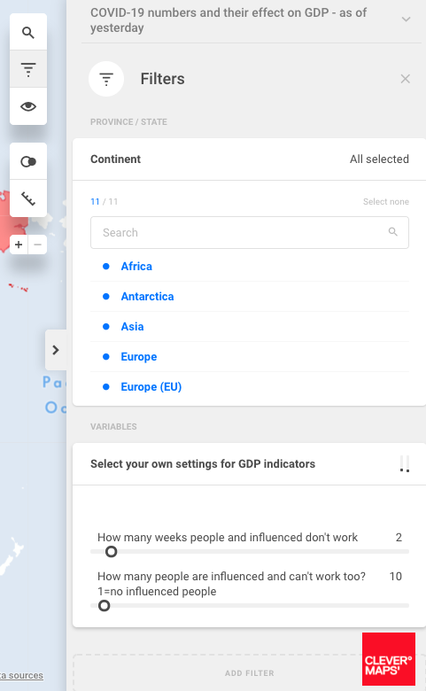
To finetune your selections, edit the filters ( )
)
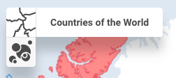
To display regional data for some countries (e.g. China), change the visualisation mode to dot-map
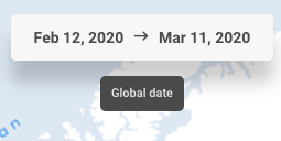
Or switch to different time period.
There are another two views in the application. You can switch between the views using menu in the upper right part of the screen.
NOTE: This project is work in progress and we will be adding new data and views.